Always a popular question: “What is the name of the font that Apple uses for the logo?” The counter question would be: “In which logo?” It has been a different typeface at different times. Currently, the "Myriad Pro Set" is the house and court font used in Apple marketing, but a few other fonts were in use by then.
Chapter in this post:
1977 - the first Apple logo in Motter Tektura
Rob Janoff designed the Apple logo in 1977. He used the color red and the font “Motter Tektura”, which was developed in 1975 by Othmar Motter in Austria. The font may still sound familiar to one or the other because it was also used by Reebok in the logo.
1984 - Think different with Apple Garamond
In 1984, Tony Stan's “ITC Garamond” font was selected as Apple's new corporate font. However, Apple felt that the font should be slightly narrower. The existing font "ITG Garamond Condensed" was too "narrow" for Apple's taste with 64% of the spacing of the "normal" Garamond, so that a version with 80% of the normal spacing could be created. This font was then used as “Apple Garamond” in the future. You know this font from all the campaigns that start with “Think different.” went along. And this addition was always placed under the Apple logo if there was enough space for it.
2002 - from Garamond serif to Myriad sans-serif
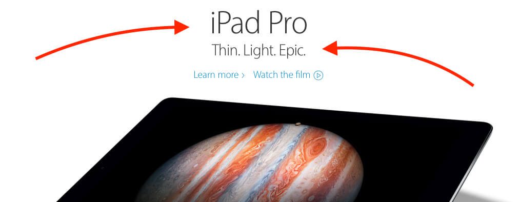
Beginning in 2002, Apple began using a variant of the Adobe Myriad font in its logo, marketing, and packaging design. The transition from a serif typeface to a sans serif typeface seems to have taken place, as the Myriad is not only more legible but also more modern than the outdated "Apple Garamond". The latest version of the Myriad is the "Myriad Pro", which Apple uses slightly modified as "Myriad Apple". The original iPod logo shows the “Adobe Myriad Pro Semibold”.

2006 - from Myriad Pro normal to light
Beginning in 2006, the "Apple Myriad" was then replaced by a new font called "Myriad Set" that includes additional symbols and ligatures. At the end of 2013, thinner variants of the Myriad Pro were used in Apple's marketing, such as the "Myriad Pro Light", which was used in headlines. An even thinner variation of the Myriad Pro Light was used in some marketing materials and press releases.
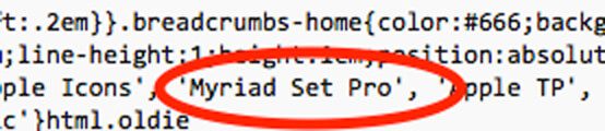
2016 - Myriad Set Pro still in use
To see what font Apple is currently using, I just took a look at the website's source code. There you will find the reference to the “Myriad Pro Set” both in the HTML code and in the CSS file.

I hope this article answers the questions about the font in the Apple logo in full. :-)
Which fonts Apple uses on the website, in Mac OS X and iOS, may soon be part of a post. ;)
My source for the background information on this article: https://en.wikipedia.org/wiki/Typography_of_Apple_Inc.
Related Articles
 Mac problem: DVD/CD won't eject? That's how it's done!
- These are the most important Apple YouTube channels and their content
- Internet Archive – possible uses of the worldwide archive
- YouTube Achievements cards and creator awards - a good motivation for creators
- Apple System Status: Find iCloud outages and issues with other Apple services here
- Mac: Find the AT sign (Klammeraffe) on the keyboard of Apple computers
- What is the difference between a plugin and an add-on?
- What is “dogfooding” in the area of hardware and software development?


Jens has been running the blog since 2012. He acts as Sir Apfelot for his readers and helps them with technical problems. In his spare time he rides electric unicycles, takes photos (preferably with the iPhone, of course), climbs around in the Hessian mountains or hikes with the family. His articles deal with Apple products, news from the world of drones or solutions to current bugs.